Now, this is just my opinion, so feel free to plot my downfall. To be successful in marketing (I think that's what Jess was getting at), we need two things: excellent customer service and interpersonal skills, and a strategic mind. For the purposes of this post, I'm defining success in terms of career progression, obtaining bigger and better clients, and being known as "the person we need on board" when it comes to marketing. See the end of the post for a caveat.
Customer Service and Interpersonal Skills
I hate Business Development Managers, or as I like to call them, glorified renamed sales reps. I hate them because that career path attracts a certain kind of personality, and its a personality type that has always rubbed me the wrong way. For their profession, however, it's what's required.
For our profession as marketers, we can't ignore our own personal branding and the way we provide service to our clients, boss, teammates, and underlings. A kind word, a quick communication, a timely update - these things will be remembered. If you want to be successful, then your interpersonal skills have to be more than up to scratch. Your name should be top of mind as "the go to guy" when a question needs answering, or when a decent pitch is required, or even someone who can keep big clients entertained at a swanky dinner. If you sit in a cubicle, huddled away, no matter how good your work is, you're only going to rise so far. It's not a matter of self-promotion; it's a matter of self-confidence and belief.
Strategic Mind
Ultimately, marketing is about strategy. It's not about creative words, images, sounds, or videos, although understanding how these can effectively work with strategy is imperative. It's not about having the best office, the best clients (though that's nice), or who can out-pitch who in an RFP.
All of that is like the augmented product of marketing; the core product will always be strategy. If you don't understand it, or if your strengths lie elsewhere, then you probably won't be a successful marketer. You may be an uberly successful account director, consultant, media planner...but you need strategy to be a marketer.
The way that the world is going these days, you'd be hard pressed to find a 'pure' marketing role. Integration is rife within both agencyland and clientland. Your job will more than likely cover coming up with a few creative words, images, sounds, or videos. It may also be heavily involved in media planning or account management; that's not a bad thing. But when push comes to shove, understanding WHY you're doing something in a campaign will be more important than any other aspect on the road to success. Your boss will appreciate your insights, you'll be regarded as "knowing your stuff" within any given discussion, and the client will want to keep you around because you look after their interests.
Caveat
There are other measures of success, like personal growth and challenge, income, job title, the kind of car you drive, the kind of family you raise, where you live, how you treat people around you...but it would be way too much to cover here.
So I had to limit myself to a capitalist consumerist view on what I think it takes to be successful as a marketer. ;)
Thursday, May 1, 2008
Round Three
Let's go with a less physical topic for today:
What is the quality that you attribute most to being successful (as is relevant to marketing)? Again, make of this whatever you will, from focusing on yourself, someone else a company etc.
On a separate note, you guys are amazing, and this is turning out beautifully thanks to you!
And, if you're still writing on the previous topic, that's fine, we'll just throw it in there.
Wednesday, April 30, 2008
The Brilliance of Thomas Edison
 When I re-visit a website, I don’t want it to be like turning on a TV. I want it to be like turning on a lightbulb.
When I turn on a TV, I see what was on last time. When I turn on a lightbulb, I know what I’m going to see.
When I turn on a TV, conversation stops. When I turn on a lightbulb, conversation starts.
When I turn on a TV, I need to make sense of my surroundings. When I turn on a lightbulb, my surroundings make sense.
When I turn on a TV, I can do what the TV wants me to do. When I turn on a lightbulb, I can do anything I want to.
When I visit a website, I want to be entertained, informed, or anything else the website may intend to do. When I re-visit a website, I want to build on that past experience – on my own terms – and not simply repeat it.
What would happen if the lights went out?
On a lighter note
That last post was pretty negative so I'm going to bring up a site that I think is really well-designed. The radio station I work for has a site called the217.com. I think this site does a solid job presenting featured information without covering up the standard info that people generally come for (what's currently playing/radio schedule and local restaurant info)
I'm not going to go on and on about this one, so you can check it out and come to your own conclusions. Mostly because I do actually have some other work to do.
I'm not going to go on and on about this one, so you can check it out and come to your own conclusions. Mostly because I do actually have some other work to do.
It hurts
When I find a website that won't relinquish its stranglehold on important information, I get this really angry jittery feeling and I start to curse profusely. So when my workplace announced that we were changing our scheduling system to an online service called HotSchedules, I was mildly skeptical.
This lasted until I actually had to use the system. Then my skepticism gave way to frustration and, subsequently, furious anger. I could rant about how bad every aspect of this system is until my fingers went numb, but I'm just going to highlight a few of the more blatant transgressions.
 Consider this example. This is a seriously tiny fragment of the total interface and yet, there's already so much wrong here. For starters - there is absolutely no need for 3 exclamation points when informing me how many unread messages I have. There's nothing all that exciting about my "1 unread messages" nor is there anything exciting about any of my 51 other total messages, which brings me to my next point. What ridiculous situation would I have to find myself in to make this notice useful. When I first saw it, I thought "maybe that's for when I have 0 messages and still want to go see my messages... and can't click on the messages button in the toolbar..." But then I checked all my messages...
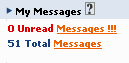
If I have to tell you what's wrong with this, please don't ever design interfaces, as a favor to me and the world at large. When I saw this on a released and established piece of software, I almost lost it. And this was only the beginning with HotSchedules. However, in the interest of brevity, I think I'm going to limit it to one or two other things that really bother me.
So when you click on the messages to take you to the messaging system this window pops up.
 I originally pressed continue without typing yes. Right now, you're probably saying "typing yes?" because you didn't read the whole thing either. But yes, this shows up every time you use the messaging system... every time. One thing designers should really be cognizant of when designing a page for usability is the use of the keyboard/mouse. The two should not be interspersed willy nilly. Use of the keyboard in a mouse-heavy site should be pretty much eliminated unless absolutely necessary. I'm pretty sure the above case does not fall into that category.
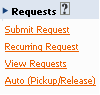 So I shouldn't have to coin this, but maybe some designers should take note: "Why have 4 buttons when you can have 1?" This requests section is on the homepage. Basically, the homepage is just littered with tiny little modules like this - clearly lacking any thought-out design. This requests module should be eliminated along with the messaging module - they both have tabs at the top of the page.
I've previously admitted that I haven't studied marketing much, this is true... but I have studied HCI/UI and this site makes me wish I hadn't. Maybe if I didn't know how blatantly this site flew in the face of every basic design principal, I could just be mildly frustrated with its clear lack of usability.
 Here's the left side of the homepage for reference. Notice how many buttons there are for requests. Two at the top and 4 in the request module. For those of you playing the home game, that's 6 buttons on the homepage that bring you to what is essentially the same place - or at least, if the program was designed well, all these functions could be accomplished in one screen.
All in all, using this program is a completely horrific experience, if you can avoid it in any way, do.
This lasted until I actually had to use the system. Then my skepticism gave way to frustration and, subsequently, furious anger. I could rant about how bad every aspect of this system is until my fingers went numb, but I'm just going to highlight a few of the more blatant transgressions.
 Consider this example. This is a seriously tiny fragment of the total interface and yet, there's already so much wrong here. For starters - there is absolutely no need for 3 exclamation points when informing me how many unread messages I have. There's nothing all that exciting about my "1 unread messages" nor is there anything exciting about any of my 51 other total messages, which brings me to my next point. What ridiculous situation would I have to find myself in to make this notice useful. When I first saw it, I thought "maybe that's for when I have 0 messages and still want to go see my messages... and can't click on the messages button in the toolbar..." But then I checked all my messages...
If I have to tell you what's wrong with this, please don't ever design interfaces, as a favor to me and the world at large. When I saw this on a released and established piece of software, I almost lost it. And this was only the beginning with HotSchedules. However, in the interest of brevity, I think I'm going to limit it to one or two other things that really bother me.
So when you click on the messages to take you to the messaging system this window pops up.
 I originally pressed continue without typing yes. Right now, you're probably saying "typing yes?" because you didn't read the whole thing either. But yes, this shows up every time you use the messaging system... every time. One thing designers should really be cognizant of when designing a page for usability is the use of the keyboard/mouse. The two should not be interspersed willy nilly. Use of the keyboard in a mouse-heavy site should be pretty much eliminated unless absolutely necessary. I'm pretty sure the above case does not fall into that category.
 So I shouldn't have to coin this, but maybe some designers should take note: "Why have 4 buttons when you can have 1?" This requests section is on the homepage. Basically, the homepage is just littered with tiny little modules like this - clearly lacking any thought-out design. This requests module should be eliminated along with the messaging module - they both have tabs at the top of the page.
I've previously admitted that I haven't studied marketing much, this is true... but I have studied HCI/UI and this site makes me wish I hadn't. Maybe if I didn't know how blatantly this site flew in the face of every basic design principal, I could just be mildly frustrated with its clear lack of usability.
 Here's the left side of the homepage for reference. Notice how many buttons there are for requests. Two at the top and 4 in the request module. For those of you playing the home game, that's 6 buttons on the homepage that bring you to what is essentially the same place - or at least, if the program was designed well, all these functions could be accomplished in one screen.
All in all, using this program is a completely horrific experience, if you can avoid it in any way, do.
Dr. Usability (Or How I Learned To Stop Worrying And Love The Web)
I'm a big fan of usability.
There are a LOT of people out there, designers included (especially flash designers, as much as I love their work) who don't understand the concept of usability. If a website isn't functional, then it's useless.
Usability covers more than just load times and depth. It looks at everything from the way the colours integrate and draw the eye, to the layout of the page, to the font, embedded information, notice that a new page will open or popup, navigation issues, compatibility for ages 3 to 103, usage statistics of the target market...it goes on. It gets very involved in Human-Computer Interaction, and is better known as User Centered Design.
I'm by no means an expert. One of my closest friends is though, and we occasionally (re: once a week) get our drink on and wax lyrical about websites with poor usability. Government websites, at any level, are PAINFULLY atrocious examples of bad usability. The example I just gave sends shivers down my spine. It's by no means the worst I've seen (I wish I'd taken a screenshot of the old Harvey Norman website...), but it just...eew.
The problem with usability is defining it. Something may strike us as completely wrong about a website, but we just can't put our finger on it. The experts can, but then again, that's why they're experts. We're just normal people.
Sometimes, though, we find a website that we love. And we'd go back again and again, just to marvel at it's prettiness. If you want to see a few sexy websites, check out your local boutique ad agencies. Sometimes they're shit, but they're updated about once every six months, so chances are they'll be close to 'cutting edge' stylistically. It's a touchpoint for potential clients, so the agencies will try to sell themselves.
Me? The one website I can't live without is my local online newspaper (and online trade mags). Sure, sometimes the articles suck, and the design isn't great, but it keeps me informed faster than reading the paper.
Ultimately, I want information from my websites, not gratuitous creativity. I don't mind what they look like, so long as they do the job. I won't be hanging around on the site long enough to care anyway! I'm Gen Y, I've got people to do, things to see, attention span of a goldfish...that doesn't mean, though, that I don't appreciate good usability for others when I see it.
Clutter on Zappos
So I've heard a lot of word of mouth (and blog) praise for zappos.com. I've heard that they have great prices, compelling customer service and good business ethics. And I love shoes...
But I HATE their website. As soon as it opens, I am hit with a barrage of clutter. All colors, sizes, and all wanting me to click on them. I feel overwhelmed, like I need a to-do list just to navigate their website.
Ok, just an example: the very first screenshot of the page, I can see two search bars, which search the exact same information. Even if these search bars had distinctly different purposes, please do not put them on the same page, it's confusing. If they don't, then it begs the question, why do I need two? In fact, why do I need any of this?
It reminds me of a recent trip to Mexico when I was walking through an open market, and all the stall owners where shoving their wares under my nose, trying to entice me into the shop.
Hi, Zappos? I'm already here, in your shop. You don't have to lure me in, you want to keep me now, and I'm currently scared and about to dart out (my mouse is aching for that back button). I really don't need to see all of your awards at this very moment, I don't want your popular searches and you can take back your three links to the return policy, remove your ding-boozelers and to-tinkers...sorry, switched to seuss-isms...
I can shop by specialty sites, shoe size, price range, category, gender, lifestyle, department all, on the first page. Yes, I want options as a consumer, but at some point, too much is too much.
Sorry Zappos, you lost me...shame too, because I was all set to love you...
Subscribe to:
Posts (Atom)
